Heads up: This post may have affiliate links. As an Amazon Associate, I earn from qualifying purchases.
Design That Converts: How to Make Your Ezine Look Professional (Part 1)
September 25, 2025 - Reading time: 4 minutes
Learn the core principles of ezine design in 2025. Discover layouts, typography, visuals, and mobile-first strategies that build trust and keep readers engaged.
An ezine lives and dies by its content but content alone doesn’t win readers. Design is the silent persuader that shapes first impressions, keeps people scrolling, and nudges them toward subscribing. In 2025, with sleek apps and polished newsletters flooding inboxes, your ezine can’t afford to look amateur. Readers will judge professionalism by how your ezine feels before they’ve even read a word.
In Part 1 of this two-part series, we’ll break down the core principles of ezine design: layouts, typography, visuals, and mobile-first considerations. These are the essentials that give your ezine credibility and make it irresistible to readers.
1. Why Design Matters for Ezines in 2025
First Impressions = Lasting Impressions
Research shows people form opinions about design within 50 milliseconds. If your ezine looks cluttered, inconsistent, or outdated, readers subconsciously devalue your content even if the writing is gold.
Reader Trust
Professional design signals authority. A clean, modern look tells readers: this is worth my time. Amateur design suggests hobby-level effort, even if your content is expert.
Competition is Fierce
Your ezine isn’t competing just with other ezines. It’s competing with Substack, Morning Brew, and high-budget digital magazines. Good design helps you punch above your weight.
💡 Pro tip: In an attention-starved world, design is your hook. Readers decide whether to keep reading or hit delete based on the feel of your layout.
2. Layouts & Structures That Boost Readability
The “F” Pattern & Z-Pattern
Studies of eye-tracking show that people scan digital content in predictable shapes.
-
F-pattern: Readers scan across the top, then down the left side, occasionally moving horizontally. This works well for text-heavy ezines.
-
Z-pattern: Best for visual layouts. The eye moves across the top, diagonally down, then across the bottom. Perfect for ezines with banners, images, and strong CTAs.
Grid Systems
A grid keeps content organized and consistent. Two-column and three-column layouts work well for balancing text with visuals. Single-column (especially in email) ensures maximum readability.
Hierarchy
Use size, bolding, and spacing to guide attention. Headlines should pop, subheads should organize, and body text should flow without fatigue.
White Space
Cramming content together suffocates readers. White space isn’t “wasted space” it’s breathing room. It increases comprehension and makes CTAs more visible.
💡 Pro tip: Every page or issue should pass the “5-second test.” Can a new reader instantly tell where the main content, supporting visuals, and CTA are?
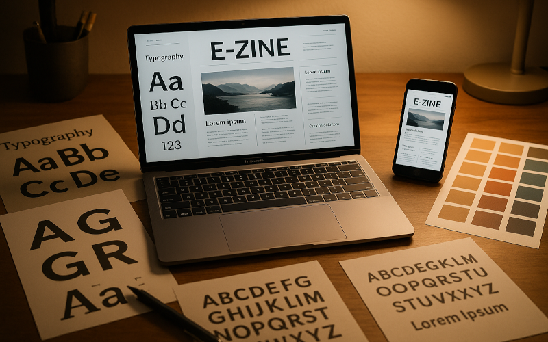
3. Typography Choices That Build Trust
Why Fonts Matter
Typography sets the tone. A playful font says “casual.” A clean sans serif says “modern.” Serif fonts suggest authority and tradition.
Best Practices for Ezines
-
Limit yourself to 2 fonts. One for headlines, one for body text. Mixing too many looks messy.
-
Size matters. Body text should be at least 16px for web/email. Headlines should scale naturally without overpowering.
-
Line spacing. Aim for 1.5 line height. It improves readability, especially on mobile.
-
Contrast. Dark text on light backgrounds (or vice versa) is easier on the eyes than gray-on-gray.
Safe Font Families
-
Sans serif: Helvetica, Arial, Open Sans, Roboto.
-
Serif: Georgia, Merriweather, Times New Roman (classic, though dated).
-
Display/Accent fonts: Use sparingly for headers or quotes.
💡 Pro tip: Consistent typography across your ezine, website, and marketing makes your brand instantly recognizable.
4. Using Visuals Effectively
Why Visuals Matter
Images break monotony, clarify complex ideas, and add emotional resonance. An ezine without visuals feels like homework.
Types of Visuals
-
Photos. Stock or original photography adds professionalism.
-
Infographics. Great for condensing stats or processes.
-
Icons. Small but powerful tools for guiding attention.
-
Multimedia. Embedded videos, podcasts, or interactive charts create depth.
Best Practices
-
Align with content. Every image should support or amplify the message not just fill space.
-
Optimize file size. Heavy images kill load speed, especially in email. Use compressed formats.
-
Accessibility. Add alt text for all visuals. It helps both SEO and visually impaired readers.
-
Brand style. Use a consistent filter, border style, or palette for cohesion.
Pitfalls to Avoid
-
Avoid overloading with stock photos that scream “generic.”
-
Don’t use low-res or pixelated images nothing screams amateur louder.
💡 Pro tip: Use visuals to highlight CTAs. A simple arrow graphic or icon near your signup button can lift conversions.
5. Mobile-First Design and Responsive Layouts
The Mobile Reality
Over 70% of newsletter and ezine readers consume content on mobile. If your ezine isn’t mobile-friendly, you’re alienating the majority of your audience.
Key Mobile Design Rules
-
Single-column layout. Multiple columns break on small screens.
-
Scannable content. Use short paragraphs, bullet points, and bold subheads.
-
Button CTAs. Make links and buttons large enough for thumbs.
-
Test across devices. What looks perfect on desktop may break on iOS or Android.
-
Responsive templates. Use tools like Mailchimp, Beehiiv, or Ghost that automatically optimize layouts.
Mobile UX Pitfalls
-
Long intro blocks before content (users won’t scroll).
-
Popups that block mobile screens.
-
Tiny fonts or low-contrast text.
💡 Pro tip: Design your ezine on desktop, but preview and edit it on mobile before publishing. If it feels clunky on your phone, it will for readers too.
Design isn’t decoration, it’s strategy. From the moment a reader opens your ezine, the layout, typography, visuals, and responsiveness all work together to tell them: This is professional. This is worth subscribing to.
Ezine Chronicles Archive - Classic reprints and curated editorials.
ArticleDrafts - Prewritten features and ghostwriting services for editors and brands.
Today's Article Writer - Freelance writing tips, job leads, and content-creation tools.
8Write - Writing craft, editing, and creative development resources.
MTDLN Media Group - Explore our full digital publishing network.
