Heads up: This post may have affiliate links. As an Amazon Associate, I earn from qualifying purchases.
Design That Converts: How to Make Your Ezine Look Professional (Part 2)
September 25, 2025 - Reading time: 4 minutes
Explore advanced ezine design strategies in 2025. Learn about branding, CTAs, ad balance, DIY vs. pro design, and the future of interactive, personalized ezines.
In the first part, we laid the foundation: layouts, typography, visuals, and mobile-first design. Those principles ensure your ezine looks polished and readable. But professional design doesn’t stop there. Once the basics are in place, you can level up with branding, conversion-focused design, ad balance, and the right tools.
Now let’s explore advanced ezine design strategies, the kind that not only make your ezine look good but also work harder for you. Because design isn’t just about style it’s about results.
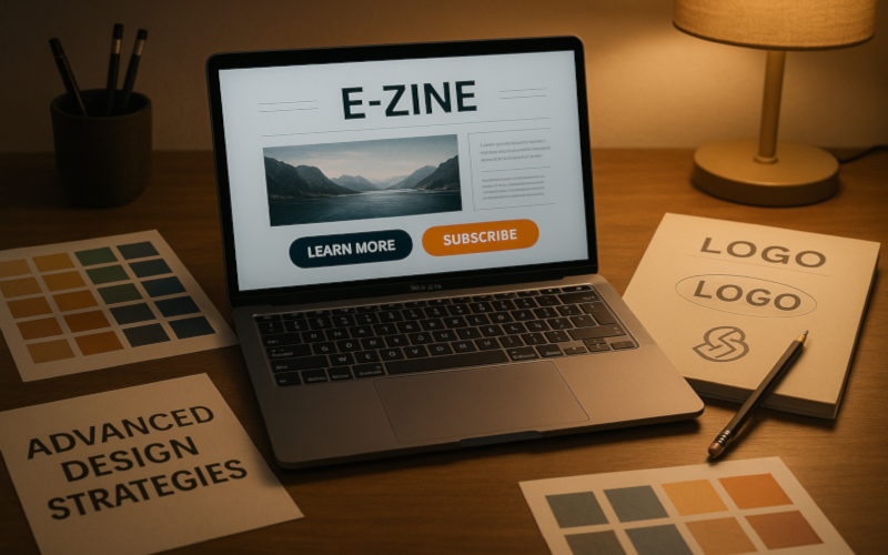
1. Branding Your Ezine (Logos, Colors, Tone)
Why Branding Matters
Branding transforms your ezine from a collection of articles into a recognizable product. A strong brand makes readers feel they’re part of something bigger than just an email list.
Core Branding Elements
-
Logo. Even a simple wordmark can elevate professionalism. Keep it clean and scalable.
-
Color palette. Stick to 2–3 primary colors that reflect your niche. Eco ezines might lean green/earth tones; tech ezines might favor blues and sleek grays.
-
Typography family. Use the same font pairings consistently across ezine, website, and socials.
-
Voice and tone. Your design should match your writing style. A playful layout clashes with formal content.
Consistency is King
Every touchpoint ezine, website, social media, even merch should reflect the same brand identity. Consistency breeds trust and recognition.
💡 Pro tip: Create a simple brand style guide for yourself. Even a one-page doc with logo, fonts, and colors will save you from drifting.
2. Calls-to-Action Placement & Design for Conversions
Design’s Hidden Job
Beyond readability, your ezine design should encourage action: subscribing, sharing, or clicking through. CTAs (calls-to-action) are where design meets marketing.
Best Practices for CTA Design
-
Clarity. “Get the Guide” beats “Click Here.”
-
Contrast. Buttons should stand out from your background.
-
Size & spacing. Big enough to tap on mobile, spaced to avoid accidental clicks.
-
Positioning.
-
Top: For high-priority CTAs like subscriptions.
-
Middle: Inline CTAs tied to content.
-
Bottom: The final nudge at the end of an article.
-
Repetition. Don’t be afraid to repeat the same CTA in multiple places.
CTA Types for Ezines
-
Subscribe buttons. Always present, never hidden.
-
Social share links. Make it easy for readers to spread the word.
-
Affiliate/product links. Blend them naturally into tutorials or reviews.
💡 Pro tip: Test CTA colors. Studies show red and green often convert higher, but every audience is different. A/B testing reveals the truth.
3. Balancing Ads & Sponsors Without Hurting UX
The Monetization Trap
Yes, ads and sponsors keep your ezine profitable but overload them and you risk losing readers. Design helps balance revenue and readability.
Placement Tips
-
Header/footer only. Keeps the main content uncluttered.
-
In-line ads. If you insert ads between sections, limit to 1–2 per issue.
-
Sidebars (on web archives). Side placement feels less intrusive.
Design Strategies
-
Native design. Style ads so they align with your ezine’s look.
-
Spacing & dividers. Use white space or subtle lines to separate ads from editorial.
-
“Sponsored by” framing. Position sponsors as supporters, not interruptions.
Reader Trust
Transparency is non-negotiable. Label ads and sponsored content clearly. Readers don’t mind ads they mind deception.
💡 Pro tip: Treat sponsors as partners. A classy, integrated ad design enhances trust and drives better results for advertisers.
4. DIY Tools vs. Hiring a Pro Designer
DIY Tools (Great for Starters)
-
Canva. Templates for ezine headers, infographics, and layouts.
-
Figma. Collaborative design for branding systems.
-
Mailchimp/ConvertKit/ Beehiiv templates. Built-in responsive designs.
-
Coolors.co. Generates professional color palettes.
When to Go Pro
-
If your ezine has a solid subscriber base and growing revenue, professional design pays off.
-
Custom layouts, illustrations, or brand kits can set you apart.
-
A designer can build reusable templates, saving you time every issue.
Hybrid Approach
Many creators start DIY, then bring in pros for a “design upgrade” once growth justifies the investment.
💡 Pro tip: Don’t wait until you feel “ready.” Even $200–$500 invested in freelance design can dramatically elevate your ezine’s look.
5. The Future of Ezine Design: Interactivity, AI, Personalization
Interactivity
Modern ezines are moving beyond static layouts. Expect more interactive elements:
-
Embedded polls and surveys.
-
Interactive charts or clickable infographics.
-
Audio snippets or video embeds.
AI-Driven Personalization
AI tools in 2025 allow hyper-custom design:
-
Dynamic CTAs that adapt to reader behavior.
-
Personalized layouts showing content relevant to each segment.
-
Smart design tweaks that optimize based on engagement.
Reader Experience First
As tech evolves, one thing stays constant: design must serve the reader. Flashy design that confuses or slows down readers still fails.
💡 Pro tip: Use emerging tools carefully. Innovation works best when it enhances not distracts from reader experience.
Design is more than decoration. It’s how your ezine communicates professionalism, builds trust, and converts readers into subscribers or customers.
Here, we explored advanced strategies: branding, conversion-focused CTAs, ad balance, DIY vs. pro design, and the future of interactivity and personalization. Paired with the fundamentals from Part 1, you now have a full design toolkit to make your ezine look and perform like a professional digital publication.
In the digital world, content may be king, but design is the crown that makes it shine.
Ezine Chronicles Archive - Classic reprints and curated editorials.
ArticleDrafts - Prewritten features and ghostwriting services for editors and brands.
Today's Article Writer - Freelance writing tips, job leads, and content-creation tools.
8Write - Writing craft, editing, and creative development resources.
MTDLN Media Group - Explore our full digital publishing network.
